UIUX -
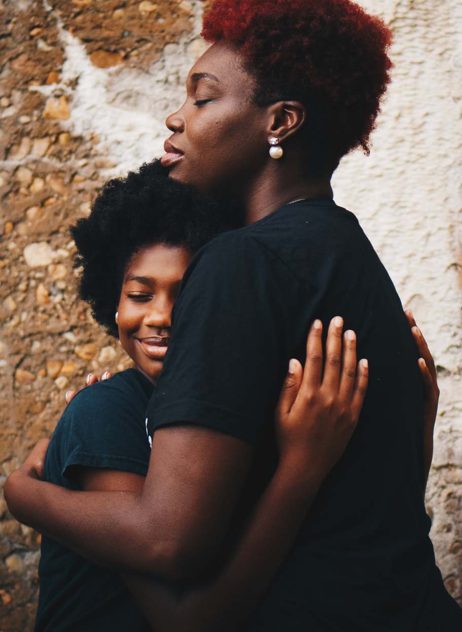
Breathe Easy
Objective_Design a resource to educate parents on bringing asthma care into the home for their children.
group project
group project
2020–2021
How to Bring Asthma Management into Home?
Parents have busy lives + a hard time getting reliable information - places they go
• Online Support Groups • Advocacy Sites • Google
Answers/ solutions get confusing with confliciting facts
Statistics
• Pediatric asthma prevalence (Chicago): 12.9%
• Significant neighborhood variability: 0 - 44%
• Pediatric asthma mortality + hospitalization in Chicago 2x national average
User
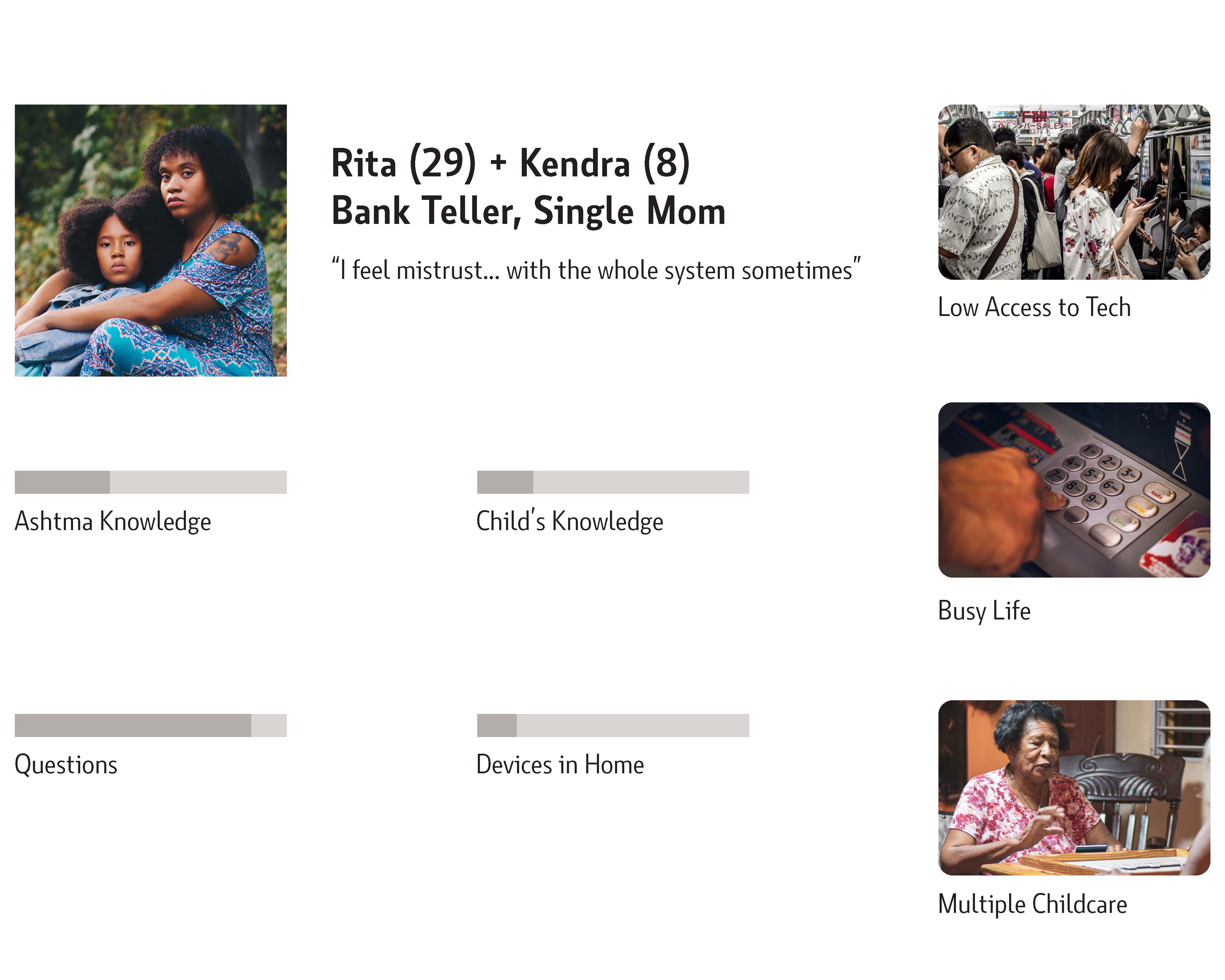
Issues
Insights
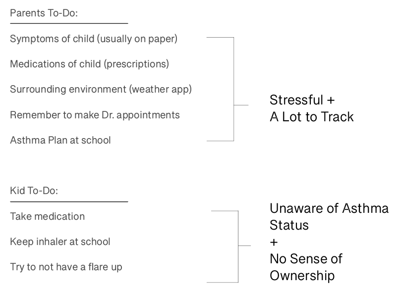
Parents + kids aren’t on same page about asthma management
Asthma apps solve one solution
Parents don’t have one reliable place to go for information


Prototyping

Inspiration
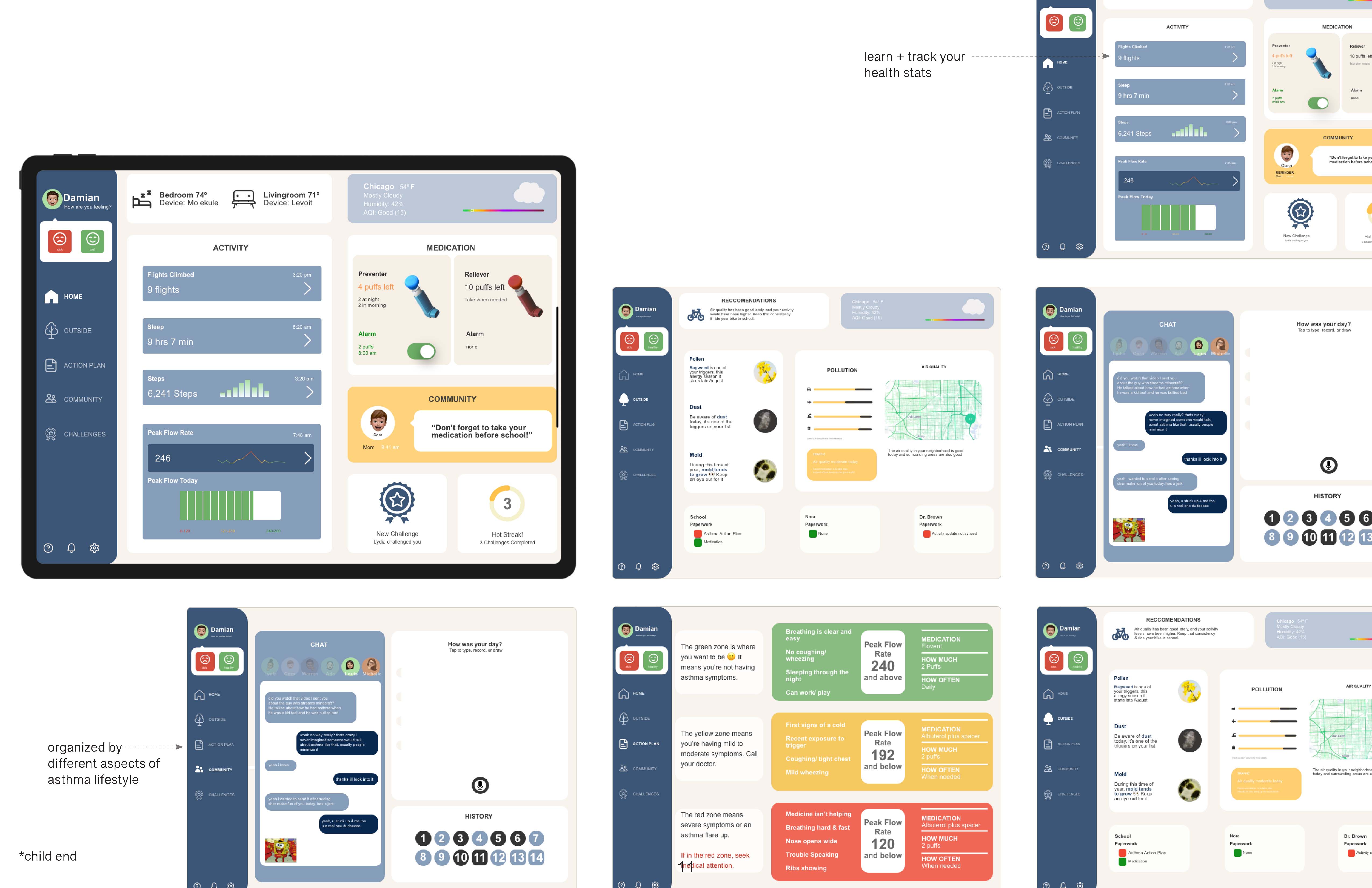
My goal was to create a double ended app for two generations that need to communicate about medical information
I needed to find a clear way to show the most relevant information to both audiences, so visual chunking was the best way to organize this
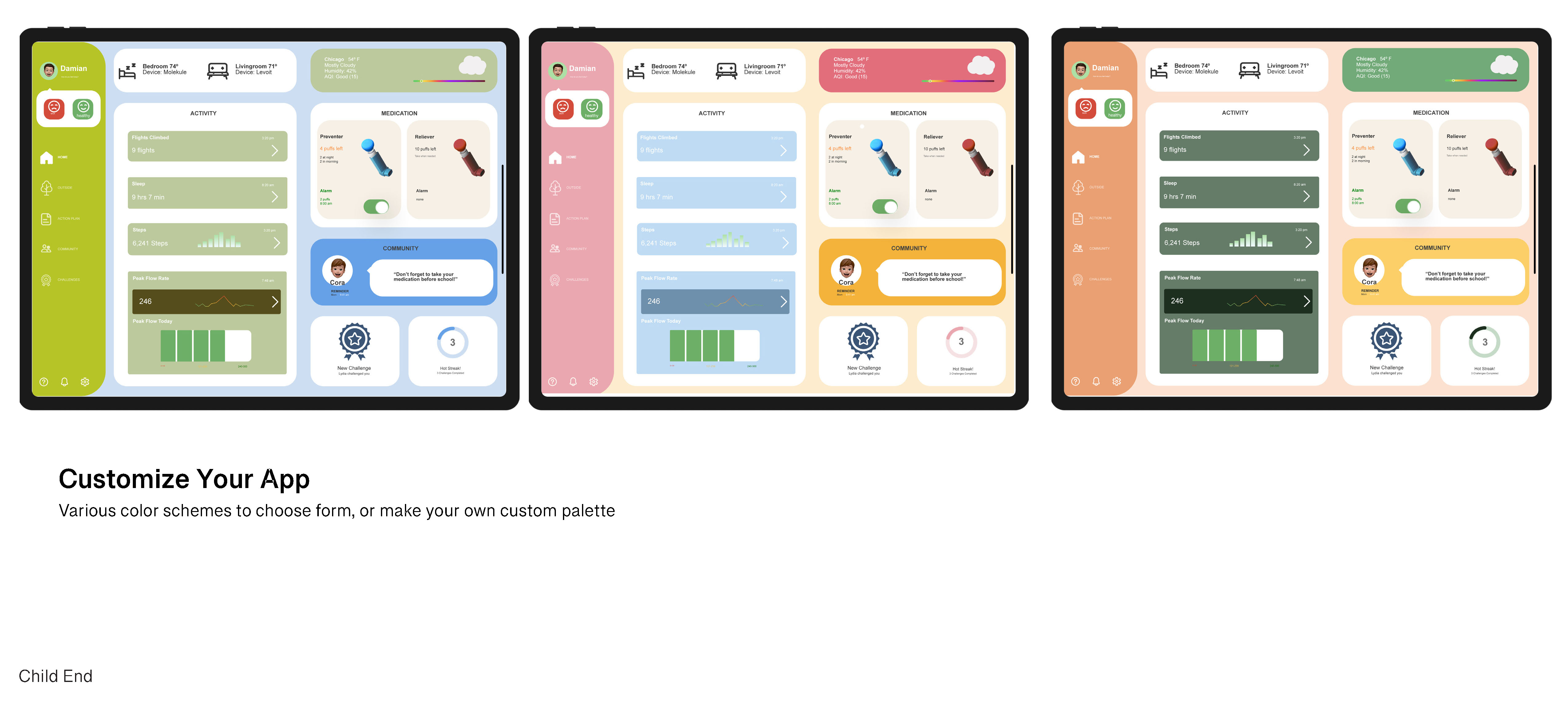
More information/ support/ resources would be on the app as well, but not highlighted on the front page

Breathe Easy

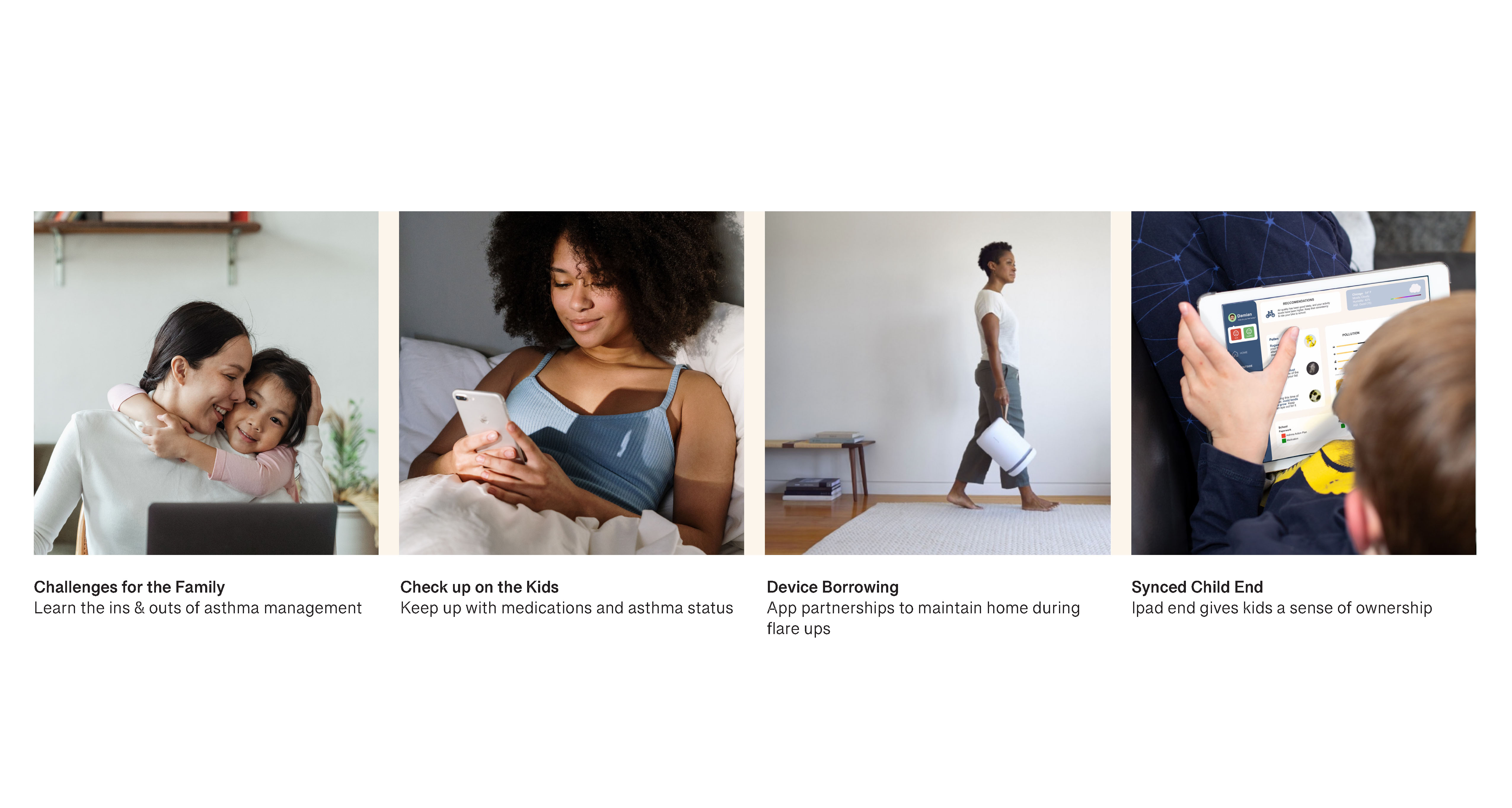
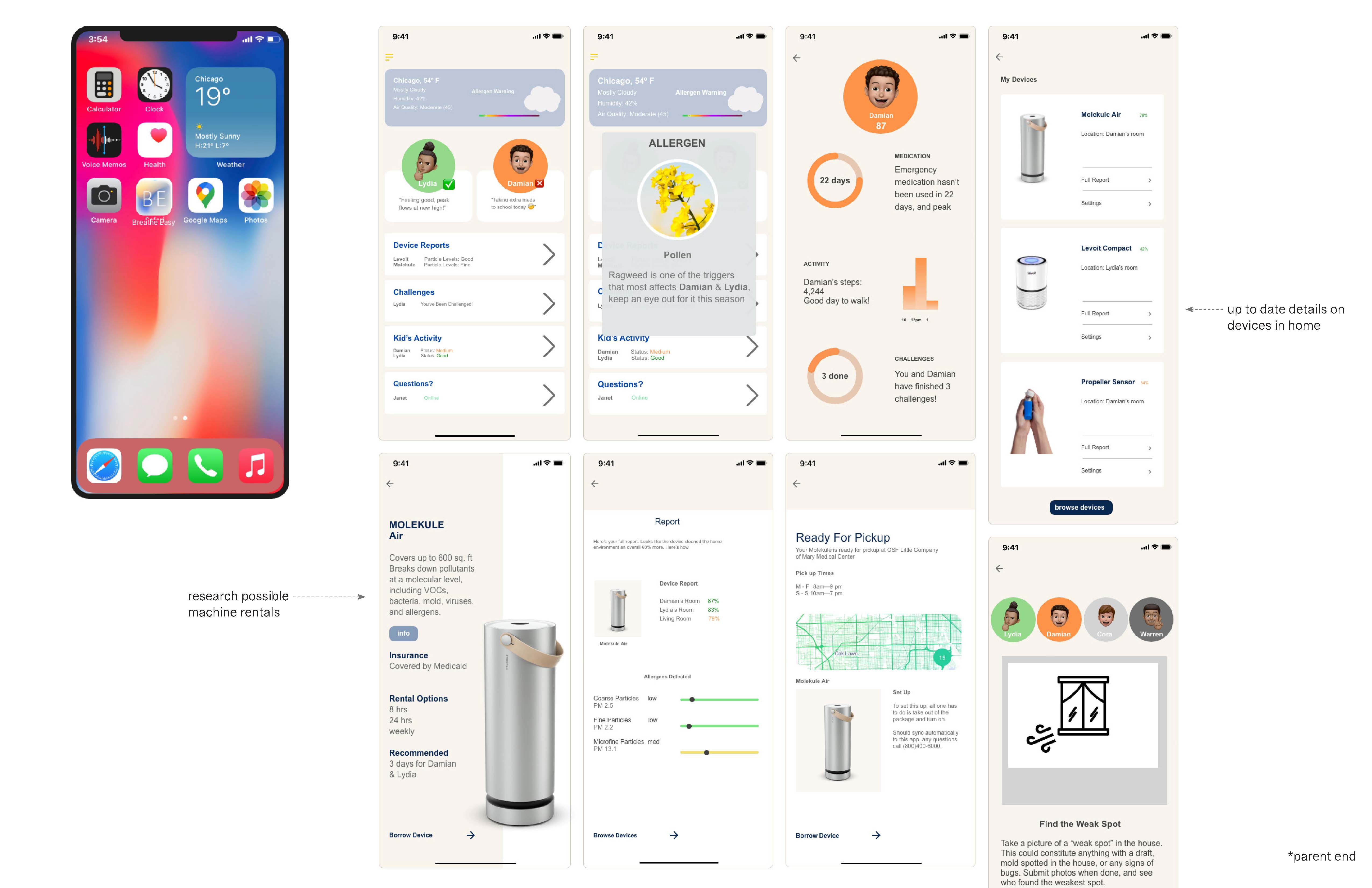
Breathe Easy - A holistic solution for asthma management
• Weather + Air Quality
• Kids’ Status + Linked to Child End iPad App
• Rent Devices in App - Reccommended by Your Doctor
• Challenges for the Family to Learn Together
• In Depth Report on Child’s Health Gathered from Smart Devices
• Ask an Expert
Brand Guidelines
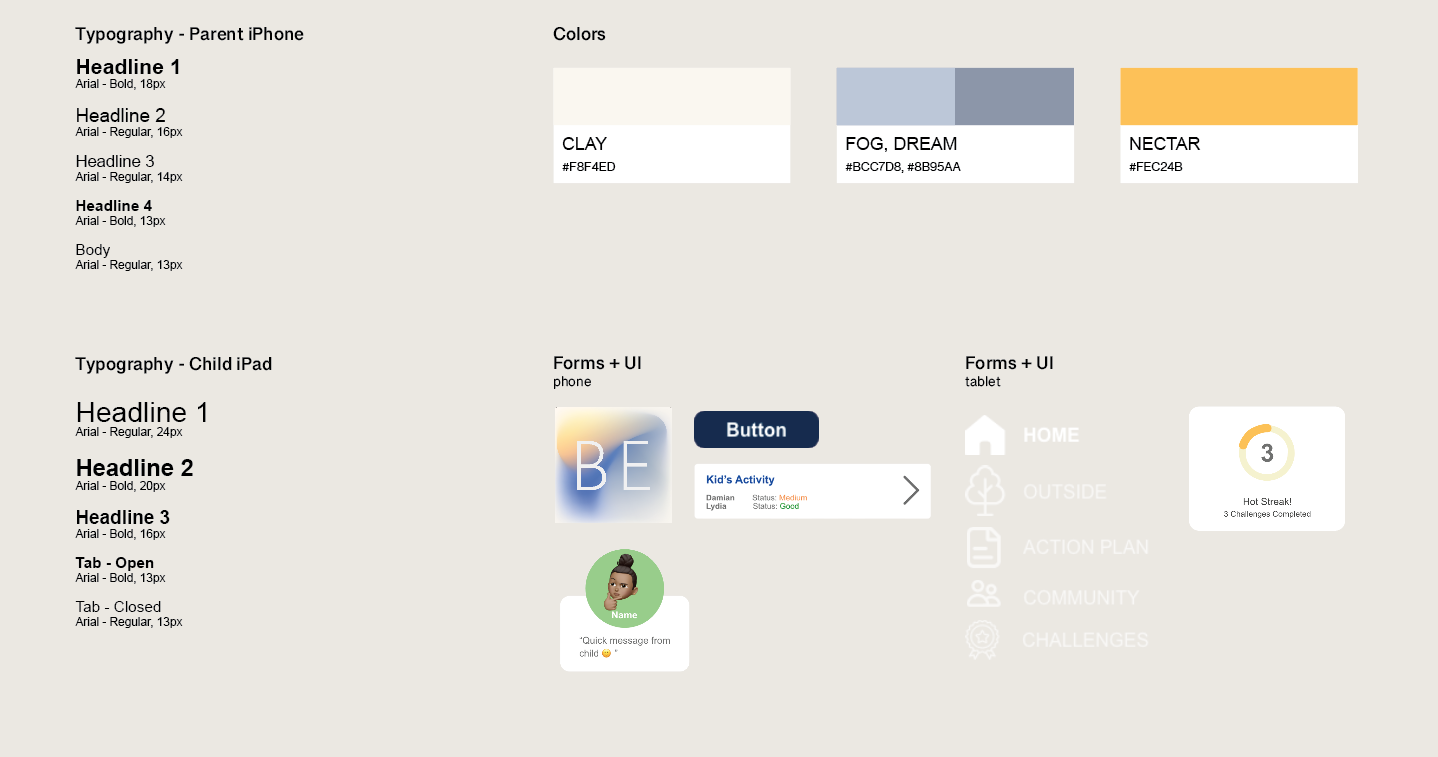

designed in Ai,Ps,Xd
UIUX -
Kitchen Product Line
Objective_As a class working together like a studio, we redesigned a line of kitchen products, the UI for each product, then the branding for the whole line of products.
group project
group project
2020
Part I: Product + UI
Slow cookers haven’t been innovated on in years
A product known to live in the “kitchen graveyard”
How do we update + better market slow cookers for people?

User

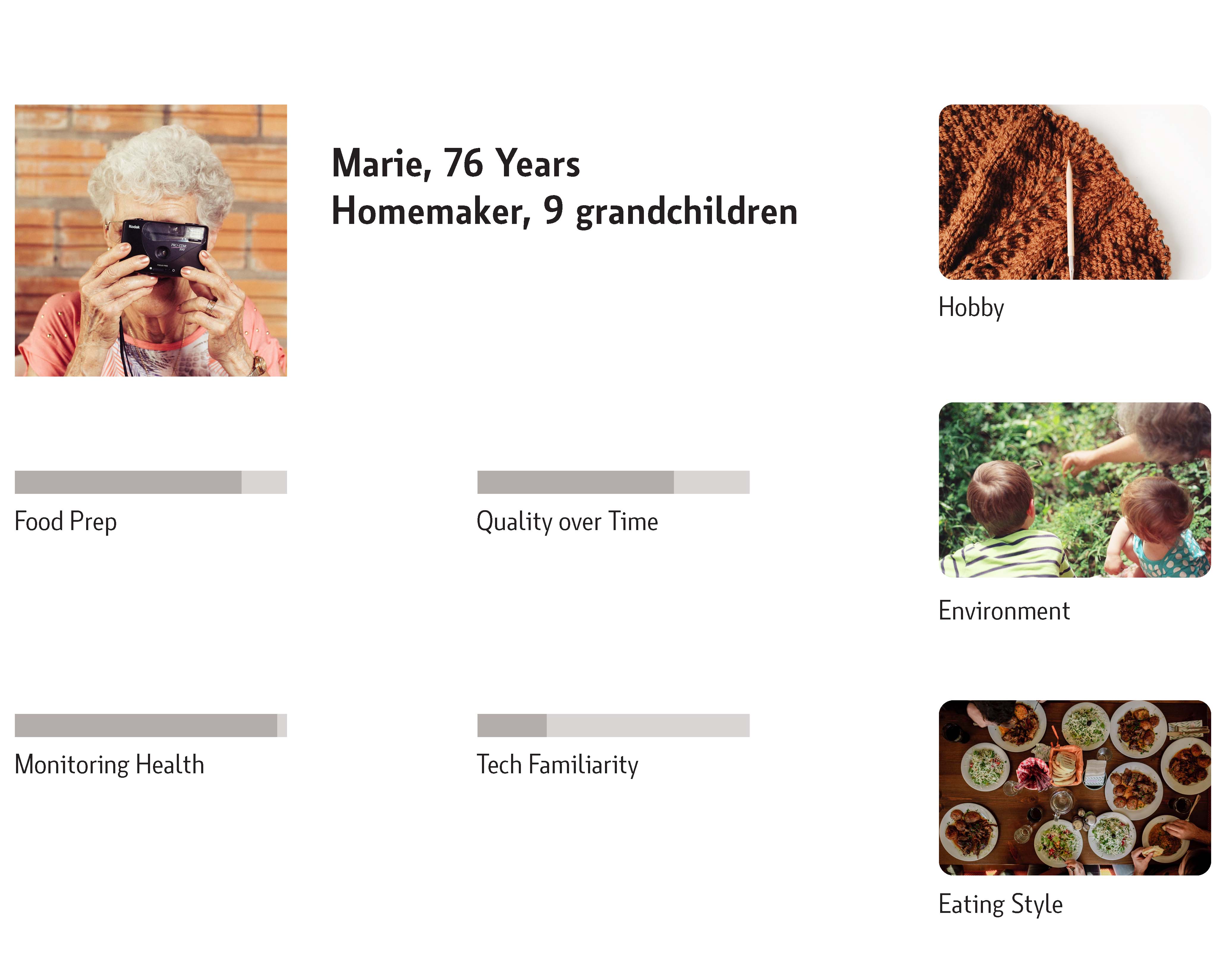
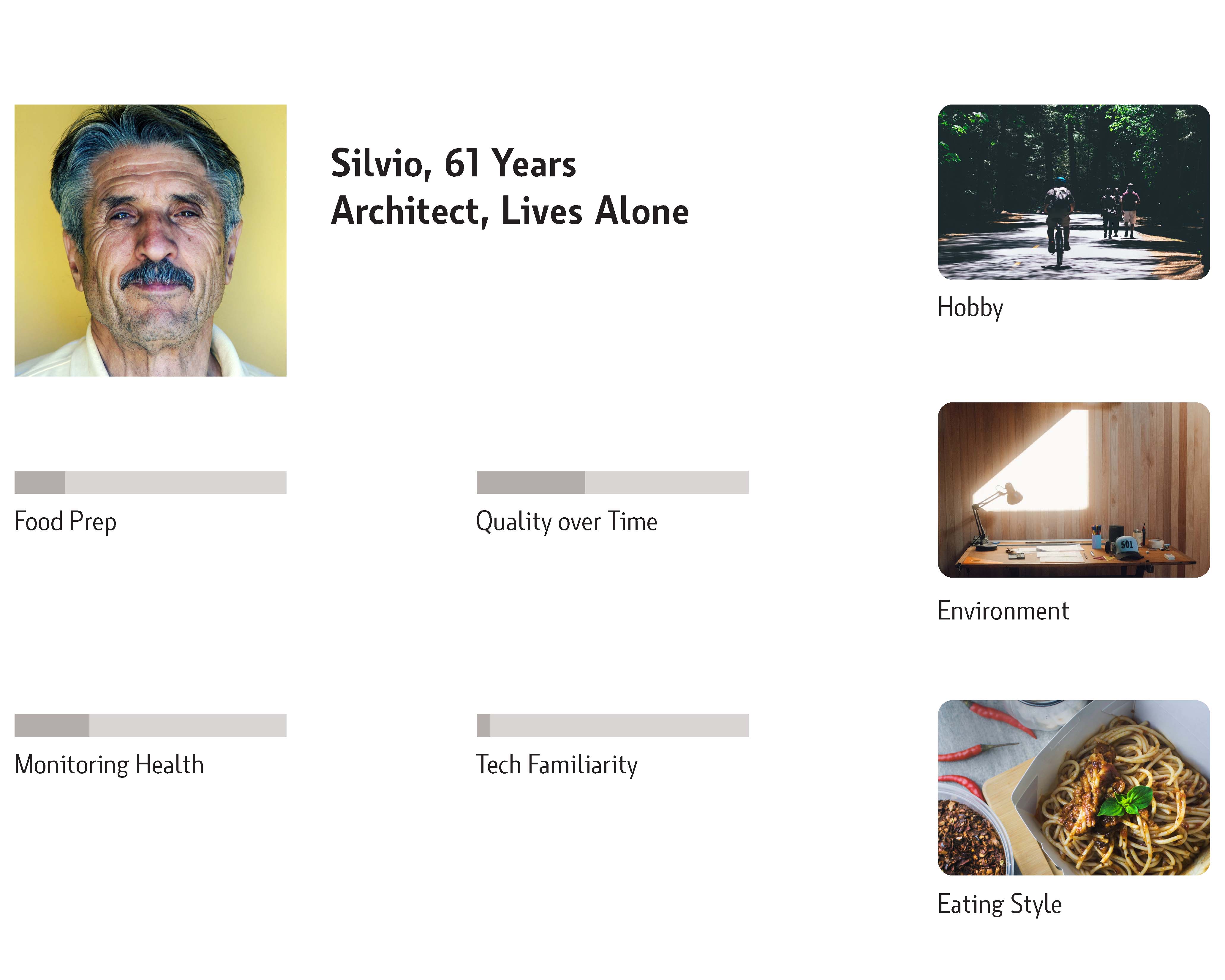
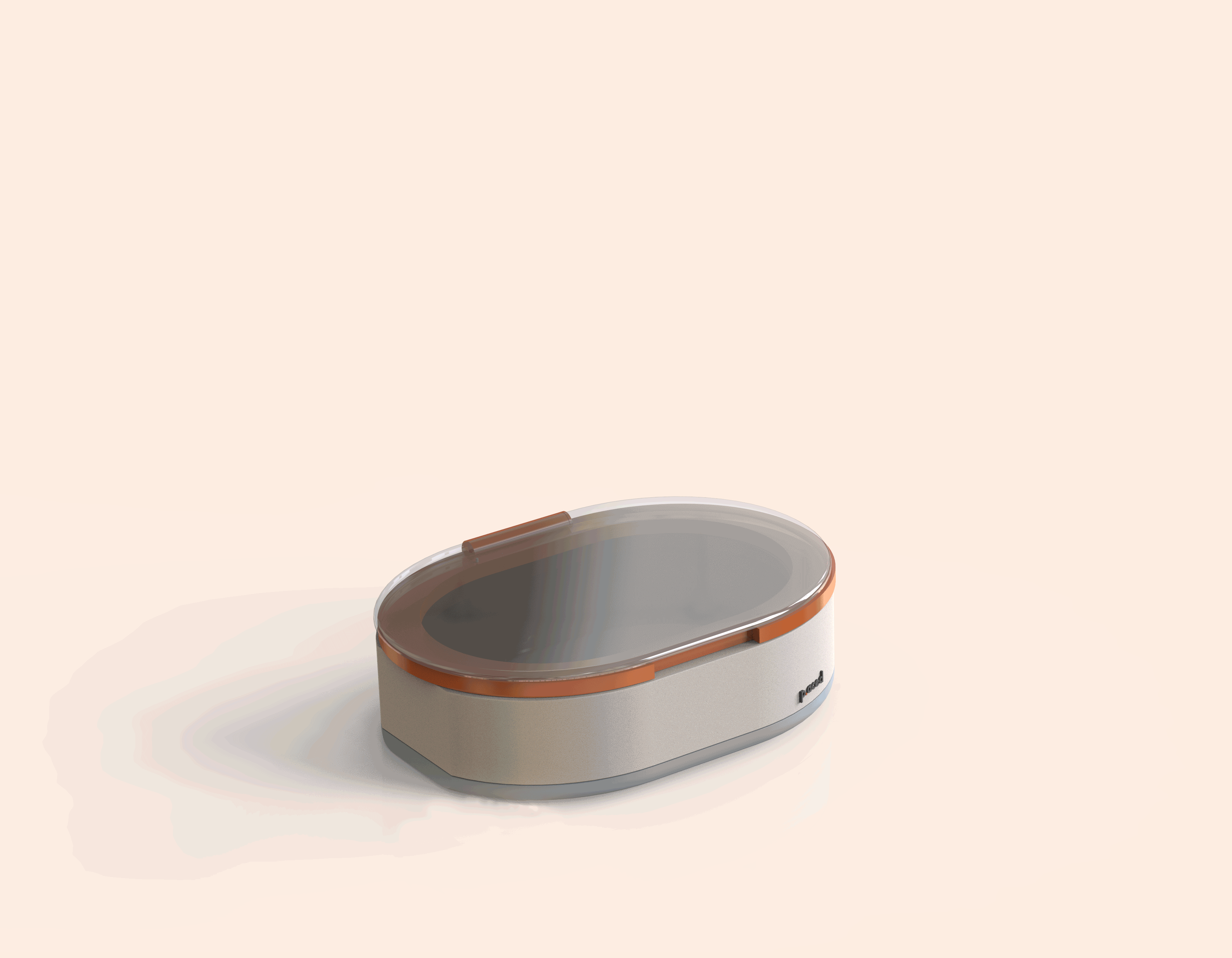
My teammate redesigned the slowcooker
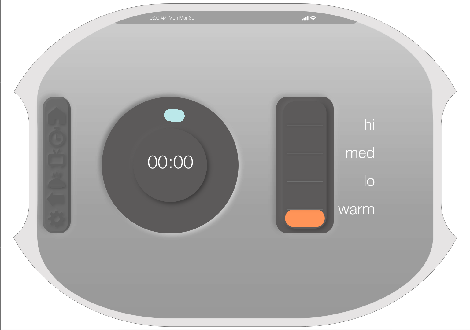
I focused on logo + UI
⬇️ This is also my first UI project! ⬇️
UI


Logo
Our goal was to remove “slow cooker” from association as we redesigned
Part II: Branding
Brand Goals
We wanted our line of products to represent
Earthy, Energetic, Futuristic
My team worked on packaging and logo; I focused on color research + web layout
Colors

Inspiration
The colors had to represent these brand principles
I explored color stories that gave these feelings of earthy, energetic, futuristic while staying in the kitchen arena
The colors had to represent these brand principles
I explored color stories that gave these feelings of earthy, energetic, futuristic while staying in the kitchen arena

final color palette
Logos not Used
Site


final site mockup - made in adobe xd
©2025 - Michelle Turcios